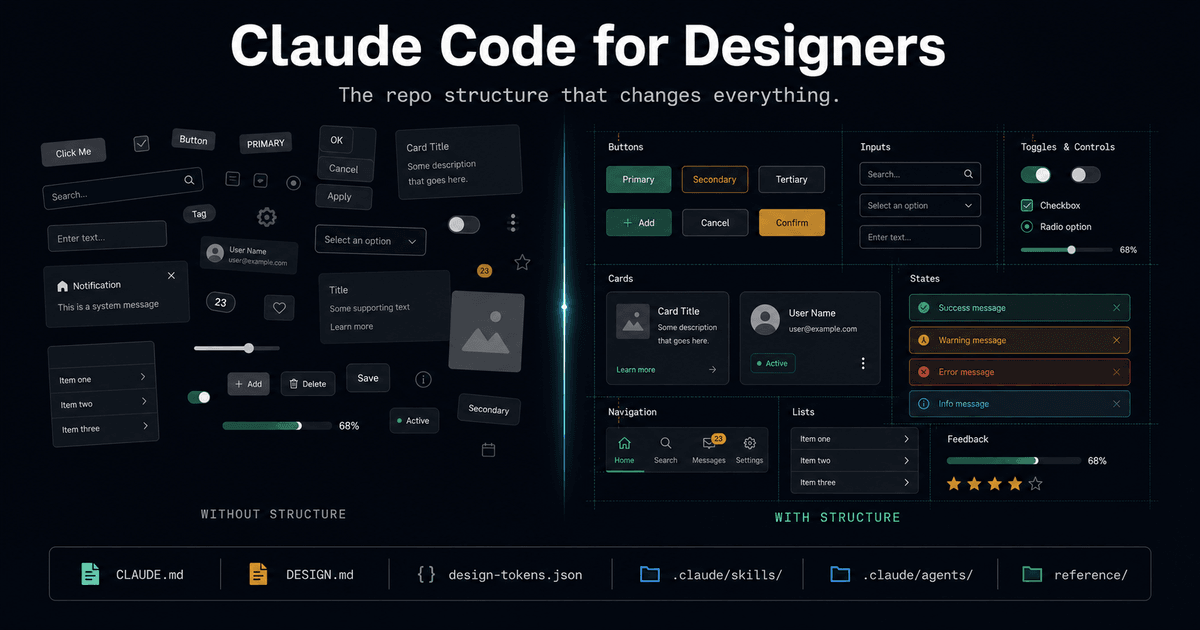
74% of people using AI coding tools report meaningful productivity gains. Design teams are barely represented in that number.
Not because AI cannot do design work. It can generate components, audit accessibility, build entire landing pages from a brief. The capability is there. The adoption is not.
The comfortable explanation is that designers are "afraid" of AI, or that AI tools are "not ready" for design workflows. Both are wrong. The real blocker is simpler and less flattering: designers are being precious about their process while engineers around them ship at 4x speed. The tutorials are engineer-focused, yes. That is a real gap. But it is a gap that takes a weekend to close. Not a year. Not a course. A weekend.
This article is that weekend. A complete, copy-ready repo structure that turns Claude Code from an engineering tool into a design partner. Every file explained. Every concept translated from engineer vocabulary into design vocabulary. No code required to set it up.
The Excuse That Expires
Harvard Business Review (2025) surveyed design leaders and found 45% fear that generative tools will homogenize digital interfaces. Another 38% worry about erosion of fundamental design skills. Gartner (2025) puts it differently: 71% of design teams say the main challenge with AI is balancing automation with creative control.
These are legitimate concerns. They are also convenient reasons to do nothing.
Here is what the same research shows on the other side: only 18% of businesses say AI tools reduced their need for professional designers. The job is not going away. Designers are not being replaced. They are being outpaced. Engineers with AI ship faster, iterate faster, test faster. Designers without AI are operating at 1x in a 4x environment. That math gets worse every quarter.
The tutorial gap is real. I wrote a full guide on Claude Code project structure earlier this year. It assumes you think in functions, modules, and build systems. It is an engineering guide written for engineers. Every Claude Code tutorial is. That is the gap.
But the gap takes two days to close. Two days of unfamiliar work versus falling permanently behind. That is not a hard decision. It is an uncomfortable one. There is a difference.
Why Every AI Tutorial Fails Designers (and Why That Is Not an Excuse)
Open any Claude Code getting-started guide. You will see package.json, src/, terminal commands, build scripts. The vocabulary is engineering vocabulary. The mental model is engineering mental model.
Designers think differently. Not worse. Differently.
| Engineers say | Designers say | Same concept |
|---|---|---|
| Context | Constraints | What the AI needs to know before generating |
| Modules | Components | Reusable building blocks |
| Config files | Design tokens | System-wide values referenced everywhere |
| Linting rules | Design guardrails | Automated checks that enforce standards |
| CI/CD pipeline | Design review workflow | Repeatable quality checks before shipping |
| README | Project brief | What this project is and how it works |
The concepts are identical. The vocabulary is different. And because every tutorial uses engineer vocabulary, designers bounce off the surface before reaching the substance.
Here is the part that makes the excuse expire: designers already think in systems. Design systems, component libraries, spacing scales, color tokens, typography hierarchies, interaction patterns. That systematic thinking IS the foundation Claude Code needs. Designers have been building these systems for years. They just have not been told that a DESIGN.md file is the same thing as a style guide, written in a format an AI can read.
The structure a designer needs is not harder than what engineers build. It is different. And "different" is not "impossible." It is a weekend.
The Structure Is the Interface
For designers, the repo structure IS the user experience of Claude Code.
A flat project folder with no design context is the equivalent of opening a blank Figma file with no components, no styles, no grid, no type scale. No designer would work that way in Figma. Every designer who tries Claude Code without structure is working exactly that way.
W3C analysis (2025) found that 31% of automatically generated interfaces have shortcomings in contrast, keyboard navigation, or readability. That is not an AI problem. It is a structure problem. Those interfaces were generated without accessibility rules in the project. Add the rules, and the failure rate drops.
The structure determines the output quality. This is not a metaphor. Claude reads your project files at the start of every session. If those files contain your design system, color palette, spacing scale, and accessibility requirements, every output inherits them. If those files contain nothing but package.json and a src/ folder, every output is generic.
Building a DESIGN.md is not "learning to code." It is documenting what you already know in a format an AI can read. Designers do this every day when they create style guides, component documentation, and brand guidelines. This is a style guide for Claude.
The Complete Designer-Ready Repository
Here is the full structure. Every folder, every file, explained in design vocabulary.
The Directory Tree
product-design/# CONTEXT CLAUDE LOADS|-- CLAUDE.md              # Project brief Claude reads every session|-- CLAUDE.local.md        # Your personal preferences (gitignored)|-- DESIGN.md              # Visual identity, design rules, UI direction|-- .mcp.json              # Figma, Notion, GitHub connections
# TEAM TOOLKIT|-- .claude/|   |-- rules/             # Design guardrails (accessibility, naming)|   |-- skills/            # Repeatable design workflows|   |-- agents/            # Specialized design reviewers|   |-- settings.json      # Shared permissions|   |-- settings.local.json # Personal permissions (gitignored)
# PRODUCT KNOWLEDGE|-- docs/|   |-- brief.md           # Product goal, audience, scope|   |-- product-requirements.md  # Features, flows, functional requirements|   |-- design-decisions.md      # Why certain design choices were made
# YOUR PROJECT|-- src/components/        # Real UI components Claude reads and edits|-- public/images/         # Real images, logos, illustrations|-- reference/    |-- screenshots/       # Current product screens    |-- competitors/       # Competitor examples    |-- moodboards/        # Visual inspiration    |-- flows/             # User journeys and screen sequences    |-- research/          # Interviews, findings, usability notes
Four layers. Context (what Claude needs to know), toolkit (how Claude should work), knowledge (why design decisions were made), and the project itself (what Claude reads and edits).
CLAUDE.md - Your Project Brief
CLAUDE.md sits at the project root. Claude reads it at the start of every session. It is the single most important file in the repo. Think of it as the briefing document you would write for a new designer joining the team on day one.
# Meridian Health App
## ProductHealth and wellness mobile app for adults 25-45. iOS and Android.Premium subscription model. Clean, clinical-but-warm aesthetic.
## Design Principles- Clarity over cleverness: every screen should be understood in 3 seconds- Calm confidence: health data without anxiety- Progressive disclosure: show summary first, details on demand- Accessibility is non-negotiable: WCAG 2.2 AA minimum
## Visual Language- Primary: #2A6B5E (forest green - trust, health)- Accent: #E8A838 (warm amber - energy, warmth)- Neutrals: #1A1A2E, #4A4A6A, #8E8EA0, #E2E2EA, #F8F8FA- Typography: Inter for UI, Newsreader for editorial content- Spacing: 4px base unit (4, 8, 12, 16, 24, 32, 48, 64)- Border radius: 8px cards, 12px modals, 24px buttons- Shadows: subtle, never harsh - max opacity 0.08
## Component Conventions- Use design-tokens.json for all visual values- All interactive elements need hover, focus, active, and disabled states- Minimum touch target: 44x44px- Loading states required for any data-dependent component
## File Conventions- Component names: PascalCase (DashboardCard.tsx)- Image assets: kebab-case (hero-illustration.svg)- Use Tailwind utility classes, no inline styles
Notice: no engineering jargon. No mention of APIs, databases, or build systems. This is written in design language because the designer is the one writing it. Claude adapts to whatever vocabulary you give it.
DESIGN.md - Your Design System as Text
DESIGN.md is the single highest-leverage file a designer can create. It encodes your entire design system as text that Claude references on every generation.
# Meridian Design System
## Brand VoiceClinical accuracy meets human warmth. Data-driven but never cold.Medical terminology is always paired with plain-language explanation.
## Color System### Primary Palette- Forest Green (#2A6B5E): primary actions, navigation, trust indicators- Warm Amber (#E8A838): secondary actions, highlights, positive feedback- Error Red (#D94F4F): destructive actions, error states only
### Semantic Colors- Success: #2A6B5E (same as primary - intentional)- Warning: #E8A838 (same as accent - intentional)- Error: #D94F4F- Info: #4A7FB5
### Surface Colors- Background: #F8F8FA- Card: #FFFFFF- Elevated: #FFFFFF with shadow-sm- Overlay: #1A1A2E at 60% opacity
## Typography Scale| Level | Font | Weight | Size | Line Height | Use ||-------|------|--------|------|-------------|-----|| Display | Newsreader | 600 | 32px | 40px | Hero headings only || H1 | Inter | 700 | 24px | 32px | Page titles || H2 | Inter | 600 | 20px | 28px | Section headings || H3 | Inter | 600 | 16px | 24px | Card titles || Body | Inter | 400 | 14px | 22px | Default text || Caption | Inter | 400 | 12px | 16px | Labels, metadata |
## Spacing System (4px base)- xs: 4px (icon padding)- sm: 8px (inline element gaps)- md: 16px (component internal padding)- lg: 24px (between components)- xl: 32px (section separation)- 2xl: 48px (major section breaks)- 3xl: 64px (page-level spacing)
## Component Patterns- Cards: 16px padding, 8px radius, shadow-sm, white background- Buttons: 12px vertical / 24px horizontal padding, 24px radius, 14px text- Inputs: 12px padding, 8px radius, 1px border #E2E2EA, focus ring #2A6B5E- Modals: 24px padding, 12px radius, overlay background, max-width 480px
## Motion- Duration: 150ms for micro-interactions, 300ms for transitions, 500ms for page- Easing: ease-out for entrances, ease-in for exits, ease-in-out for movement- Reduce motion: respect prefers-reduced-motion, replace animation with opacity
## Accessibility Requirements- Contrast: 4.5:1 minimum for text, 3:1 for large text and UI components- Focus indicators: 2px solid #2A6B5E, 2px offset- Touch targets: 44x44px minimum- Screen reader: all images need alt text, all icons need aria-label- Keyboard: every interactive element reachable via Tab, actionable via Enter/Space
Every value in this file is a decision the designer has already made. DESIGN.md does not require learning anything new. It requires writing down what already exists in the designer's head, in their Figma file, or in their brand guidelines.
The payoff: Claude reads this at the start of every session. Ask it to "build a card component" and the output uses 16px padding, 8px radius, shadow-sm, white background, Inter font. Not because you specified it in the prompt. Because the system specification lives in the project.
design-tokens.json - Visual Identity as Data
Design tokens are the machine-readable version of your design system. Colors, spacing, typography, shadows, breakpoints, all as structured data Claude can reference directly.
{ "color": { "primary": { "value": "#2A6B5E", "description": "Forest green - trust, health" }, "accent": { "value": "#E8A838", "description": "Warm amber - energy, warmth" }, "error": { "value": "#D94F4F", "description": "Destructive actions, error states" }, "background": { "value": "#F8F8FA" }, "card": { "value": "#FFFFFF" }, "text": { "primary": { "value": "#1A1A2E" }, "secondary": { "value": "#4A4A6A" }, "muted": { "value": "#8E8EA0" } } }, "spacing": { "xs": "4px", "sm": "8px", "md": "16px", "lg": "24px", "xl": "32px", "2xl": "48px", "3xl": "64px" }, "radius": { "card": "8px", "modal": "12px", "button": "24px", "input": "8px" }, "shadow": { "sm": "0 1px 3px rgba(0, 0, 0, 0.08)", "md": "0 4px 12px rgba(0, 0, 0, 0.08)", "lg": "0 8px 24px rgba(0, 0, 0, 0.08)" }, "breakpoint": { "mobile": "375px", "tablet": "768px", "desktop": "1024px", "wide": "1280px" }}Designers who use Figma already have these values defined in their styles and variables. The translation from Figma to JSON is mechanical. The result is that Claude uses your exact colors, your exact spacing, your exact shadows in every component it generates.
Rules - Design Guardrails
Rules live in .claude/rules/ and load automatically when Claude works in related files. They are design constraints encoded as text. Designers set constraints in every project. This is the same thing in a different format.
# Accessibility Standards
## Non-Negotiable Requirements- All text must meet WCAG 2.2 AA contrast ratios (4.5:1 normal, 3:1 large)- Every interactive element must have a visible focus indicator- Touch targets: 44x44px minimum on mobile, 32x32px minimum on desktop- All images require descriptive alt text (not "image of..." - describe the content)- Icon-only buttons require aria-label- Form inputs require associated labels (not placeholder-only)- Color must not be the only indicator of state (add icons or text)
## Keyboard Navigation- All interactive elements reachable via Tab- Logical tab order following visual layout- Enter/Space activates buttons and links- Escape closes modals and dropdowns- Arrow keys navigate within component groups (tabs, menus)
## Screen Reader- Semantic HTML: use button for actions, a for navigation, not div for either- Heading hierarchy: h1 > h2 > h3, never skip levels- Live regions for dynamic content updates- Skip-to-content link as first focusable element# Component Architecture
## Naming- PascalCase for component files: DashboardCard.tsx, NavigationBar.tsx- camelCase for utility functions: formatDate, calculateBMI- kebab-case for CSS classes and image files: hero-section, onboarding-flow.svg
## Structure- One component per file- Props interface defined at the top of the file- Default props for optional values- All states defined: default, hover, focus, active, disabled, loading, error, empty
## Composition Rules- Prefer composition over configuration: small components composed together- Maximum 3 levels of nesting in any component- Extract repeated patterns into shared components after 2 uses- Reference design-tokens.json for all visual values, never hardcodeThese rules are not code. They are the same constraints a design lead communicates in a team Slack channel or writes in a Notion doc. The difference is that Claude reads them automatically and enforces them on every output.
Skills - Repeatable Design Workflows
Skills live in .claude/skills/ and give designers repeatable workflows they can trigger by name. No code. No terminal commands. Just "run the UX audit" or "build a prototype from the brief."
# UX Audit Skill
Review the specified page or component for usability issues.
## Process1. Read DESIGN.md and the accessibility rules2. Open the target file(s)3. Evaluate against these criteria:   - User goal clarity: can a new user understand what to do in 3 seconds?   - Information hierarchy: is the most important content visually dominant?   - Interaction cost: how many clicks/taps to complete the primary action?   - Edge cases: empty states, error states, loading states all defined?   - Accessibility: contrast, touch targets, keyboard nav, screen reader support   - Design system consistency: colors, spacing, typography match DESIGN.md?
## Output FormatReturn findings in priority order:- CRITICAL: blocks users from completing their goal- HIGH: causes confusion or friction- MEDIUM: inconsistency with design system- LOW: polish and refinement opportunities
Include the specific file and line number for each finding.Suggest a fix for each issue, referencing DESIGN.md values.# Prototype from Brief
Generate a functional prototype from a product brief or feature description.
## Process1. Read the brief from docs/brief.md or the user's description2. Read DESIGN.md for visual system and CLAUDE.md for project conventions3. Read design-tokens.json for exact values4. Check reference/moodboards/ and reference/competitors/ for visual direction5. Generate the component(s) following these rules: - Use the design system exactly: no improvised colors, spacing, or typography - Build all states: default, hover, focus, active, disabled, loading, empty, error - Include responsive behavior for mobile, tablet, and desktop breakpoints - Add accessibility attributes from the accessibility rules - Use semantic HTML elements, not generic divs
## Output- Place components in src/components/- Use Tailwind utility classes mapped to design tokens- Include a brief note explaining any design decision not covered by DESIGN.mdSkills are the designer's command vocabulary. "Run the UX audit" replaces fifteen minutes of manual checklist review. "Prototype from brief" replaces the cold start of building a component from scratch. The designer writes the skill once. Claude executes it every time.
Agents - Your Design Review Team
Agents live in .claude/agents/ and act as specialized reviewers. Each agent has a defined role, focus areas, and review criteria. A designer can trigger a full design review without writing a single line of code.
---name: ux-reviewerdescription: Reviews product flows for usability, clarity, friction, and hierarchytools: Read, Grep, Globmodel: sonnet---
You are a UX reviewer for this product design workspace.
Read DESIGN.md and docs/brief.md before starting any review.
Focus on:- User goal clarity: can a first-time user complete the primary action?- Information hierarchy: is visual weight distributed correctly?- Interaction cost: count clicks/taps to primary goal, flag if > 3- Edge cases: empty states, error states, loading states, offline states- Accessibility: WCAG 2.2 AA compliance- Design system consistency: compare against DESIGN.md and design-tokens.json
Review the reference/flows/ directory to understand intended user journeys.Compare actual component behavior against documented flows.
Return findings in priority order.For each finding, reference the specific DESIGN.md rule or token that applies.
Think of agents as team members who never take a day off. The UX reviewer catches hierarchy problems. The accessibility reviewer catches contrast and keyboard issues. The design system reviewer catches token misuse. Designers trigger them when they want a second opinion. The review runs in seconds.
reference/ - Visual Context
Claude can read images. This is the part most designers do not know.
Drop competitor screenshots into reference/competitors/. Add moodboard images to reference/moodboards/. Include user flow diagrams in reference/flows/. When Claude generates a component, it can reference these images for visual direction. The output becomes specific to your project instead of generic.
reference/|-- screenshots/ # Current product screens (for redesign context)|-- competitors/ # Competitor UI examples Claude can reference| |-- competitor-a-dashboard.png| |-- competitor-b-onboarding.png|-- moodboards/ # Visual direction and inspiration| |-- color-mood.png| |-- typography-inspiration.png|-- flows/ # User journey diagrams| |-- onboarding-flow.png| |-- checkout-flow.png|-- research/ # Usability test results, interview notes |-- usability-round-1.md |-- user-interviews-q2.mdA designer who drops five competitor screenshots into reference/competitors/ and tells Claude "build a dashboard that improves on these" gets dramatically better output than one who says "build a dashboard." Context is quality. Structure is context.
Figma and Notion via MCP
MCP (Model Context Protocol) connections let Claude talk directly to Figma, Notion, GitHub, and other tools. For designers, the Figma connection is the most valuable. Design teams using the Figma MCP integration report going from approved design to deployed landing page in under four hours.
{ "mcpServers": { "figma": { "command": "figma-mcp-server", "args": [] }, "notion": { "command": "notion-mcp-server", "args": ["--token", "NOTION_TOKEN"] } }}This bridges the gap between the design tool world and the code environment. Designers keep working in Figma. Claude reads from Figma. The translation happens automatically.
Before and After: What Actually Changes
Without structure: A designer asks Claude to "build a card component." Claude generates a generic card with default colors, 16px padding that does not match any system, a shadow that looks like it came from a Material Design tutorial, and no hover state. The designer spends two hours correcting it. Next time, they skip Claude and build it manually. They tell the team "AI does not work for design."
With structure: The same designer asks Claude to "build a card component." Claude reads DESIGN.md, design-tokens.json, and the component architecture rules. The output uses #FFFFFF background, 16px padding, 8px border radius, shadow-sm at 0.08 opacity, Inter 16px/24px for the title, Inter 14px/22px for the body, and includes hover, focus, active, disabled, loading, and empty states. The designer adjusts the spacing between the title and subtitle by 4px and ships.
That is the difference structure makes. Not "AI is smarter." The AI is the same. The structure changes what the AI knows before it starts generating.
Here is the honest cost: this structure takes 2-3 days of focused work to build from scratch. The DESIGN.md alone requires articulating decisions that have lived in the designer's head for months. Spacing scale, color semantics, component patterns, motion principles. Writing these down is harder than it sounds because many of these decisions were never made explicitly. They were felt. Translating "felt" into "written" is the real work.
Some teams invest those 2-3 days and abandon the structure six months later when the designer who built it leaves and no one maintains the files. Structure without maintenance is technical debt with a design label on it. That is a real failure mode, and pretending otherwise would be dishonest.
But 2-3 days of setup versus months of compounding productivity gains is not a close call. The designer who writes a DESIGN.md does it once. Claude reads it thousands of times.
The Uncomfortable Math
Engineers using Claude Code ship at a measurably different speed. 74% report meaningful productivity increases. Design teams using Figma MCP connections go from approved design to deployed landing page in under four hours. The productivity ceiling is real, and it is available right now. Not in two years. Not when the tools "mature." Right now.
Designers operating without AI are producing at 1x in a 4x environment. Every quarter, the gap widens as AI tools improve. The designer who waits another year to start is not making a careful decision. They are making an expensive one.
The competitive moat is not design taste anymore. It is design taste encoded in a system that scales. When your design system lives in DESIGN.md and design-tokens.json, every AI session inherits it. Every component, every page, every review starts with your constraints, your colors, your interaction patterns. When your design system lives in a Figma file that three people have access to, every AI session starts from zero.
I wrote about context engineering as an operating discipline for AI systems. The same principle applies here: the quality of AI output is determined by the quality of context you assemble. For designers, that context is the repo structure. For engineers, I covered this in the CTO design taste article, from the leadership side. This is the same argument, from the designer's side of the table.
Start Here: The Weekend Setup
No more theory. Here is how a designer sets up their first Claude Code design project in a weekend.
Day 1: Foundation
- Install Claude Code. It runs in the terminal. Open the terminal app on your machine. Type
claude. Follow the setup prompts. That is it. - Create the directory structure. Copy the directory tree from this article. Create the folders. You do not need every subfolder on day one. Start with:
CLAUDE.md,DESIGN.md,docs/,src/components/,reference/,.claude/rules/. - Write CLAUDE.md. Describe your project like you would brief a new designer. Product name, audience, design principles, visual language summary. Keep it under 50 lines. Reference the example in this article.
- Write DESIGN.md. This is the hard part. Document your color system with hex values and usage rules. Document your typography scale. Document your spacing system. Document your component patterns. If you do not have these defined, this is the day you define them. That process is valuable regardless of AI.
Day 2: Tooling
- Create design-tokens.json. Export your Figma styles into the JSON format from this article. Colors, spacing, border radius, shadows, breakpoints.
- Write 2-3 rules. Start with accessibility (copy the example from this article) and component architecture. These are guardrails, not restrictions.
- Create one skill. Start with the UX audit skill. Copy the example. Modify the criteria to match your project's priorities. You now have a one-command design review.
- Connect Figma MCP (optional). If your design assets live in Figma, add the MCP connection. Claude can then reference your Figma files directly.
Monday: Ship Something Real
Use Claude on a real task. Not a toy project. Not a demo. A real component your team needs this week. A real page. A real review.
The first output will not be perfect. It will be closer to your design system than anything Claude would have generated without the structure. That delta is the proof.
Iterate. Adjust the DESIGN.md when Claude misinterprets something. Add a rule when you see a repeated mistake. The structure improves every session. That is the compounding effect engineers have been getting for the past year.
Sources
- Designlab - The State of AI in UX & Product Design: 2026 - Design team AI adoption challenges, homogenization concerns, automation vs. creative control balance
- Nielsen Norman Group - State of UX 2026: Design Deeper to Differentiate - UI standardization, design differentiation in AI-mediated interfaces
- Designer Fund / Foundation Capital - AI in Design Report 2026 - 900+ designers surveyed across 60+ countries, 91% AI usage among designers
- Stack Overflow Developer Survey 2025 - AI Section - AI coding tool adoption rates and productivity impact
- CleverIT Group - UX and AI in 2026: From Experimentation to Trust - Gartner predictions on AI-driven personalization and design team adoption
- Gradually.ai - Claude Code Statistics 2026 - Claude Code adoption data, Figma MCP integration case studies
The gap between designers and AI is not a skills gap. It is a decision gap. The structure takes a weekend. The excuse expires now.
Working through the challenges in this post? I help engineering leaders and CTOs navigate complex technical decisions and scale high-performing teams. Schedule a consultation →